
The efficiency of your landing pages will determine how well your digital marketing initiatives perform. An attractive landing page draws in visitors, draws them in with your content, and turns them into leads, paying customers, or bookings. A few core Best Practices for Great Landing Pages are frequently all that are needed to get great conversions. Together with the examples of successful companies, we delve into the most significant of these recommended practices in this article.
Table of Contents
Best Practices for Great Landing Pages
Use Images Carefully

Just 10% of those who simply hear the same information remember it, compared to 65% of people who retain knowledge linked with related imagery. It is therefore essential to include an image of someone utilizing your service or product, or one that shows what the visitor will get if they convert on your landing page. Your photos should never detract from your visitors; instead, they should increase conversions. Your photos should be creative, eye-catching, and inspirational, but they also need to be placed with purpose to move the reader to take action.
Craft Engaging CTAs
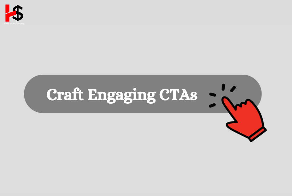
The call-to-action button is the most important part of any landing page because it is the main driver of fresh lead generation in your system. If this button is absent, you are losing out on potential clients, which will make the remaining text and graphics on your page seem less important. Three essential components of a well-written call to action (CTA) can increase your conversion rate by tens or even hundreds of percentage points.
You have to make the visitors feel obligated to click on the call to action (CTA) button. Stay away from vague or uninteresting text like “submit” or “get started” and instead concentrate on interesting, customized copy like “Send me the eBook” or “Get my free trial.” Clearly state what the user will get when they click the button.
If you want to draw the most attention to your call-to-action (CTA) button, the color of the button must contrast with the items around it. To find the colors that work best for your particular business, conduct A/B testing. Color preferences vary widely depending on persona and industry, so don’t base your decisions only on general “best practices” that might not apply to your situation. When choosing colors for your page’s backdrop and other elements, it’s often best to stay with hues on the left side of the color wheel, including green, blue, and purple. Keep your CTA button(s) in contrasting colors.
Don’t Complicate Your Form
You can drastically lower your conversion rates with a poorly designed lead collection form. In general, potential clients are hesitant to spend a lot of time disclosing a great deal of personal information just to take advantage of a deal. Just ask for the information that is really necessary, keeping in mind that people might be more inclined to divulge more details if they end up becoming clients. It can be advantageous to use A/B or split testing in your marketing, which compares the effectiveness of two landing pages. This testing method is very useful for form design because it determines how much data users are willing to provide. Form fields that are too many could turn off users. Get our A/B testing toolkit to improve your landing pages.
Remove Navigation and Other Distractions
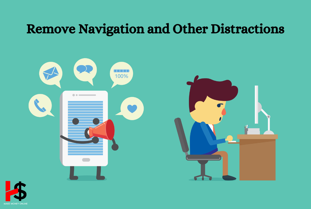
Keep other distractions to a minimum as these could drive visitors away from an excellent landing page, which concentrates on a single conversion goal. Avoid providing pointless connections that take users away from your landing page, such as site navigation, extra calls to action, or even links that take users back to your homepage. It is optimal for your landing page to function independently.
Sales Pages
Sales pages promote quick purchases. They work well when prospects are inspired to make a purchase by the compelling information on the landing page. On the other hand, layering on information and providing an additional means of familiarizing oneself with the good or service can be helpful for customers who aren’t quite ready to buy. The sample below, for instance, contains two buttons: one for making a purchase and another for taking a product test drive.
Read More:
