
In this article, you’ll learn some of the core elements and 7 basic principles of Graphic Design that every graphic designer should be familiar with.
Graphic design is a powerful tool for businesses, and the current high demand for graphic designers in the corporate marketing sector. Its good to say that it’s the most desired thing by organizations. When collaborating with clients, remember that you have just one opportunity to leave a lasting and positive impression. So, why not enhance their experience by applying your knowledge of design elements to a variety of projects such as social media graphics, web and app user interfaces, videos, banners, advertisements and more.
These design elements and principles are the fundamental building blocks of creative design. An in-depth understanding of these principles and their application within a design context greatly contributes to get the successful design outcomes.
Table of Contents
7 Basic Principles of Graphic Design
Here are the 7 basic principles of the Graphic Design:
Balance
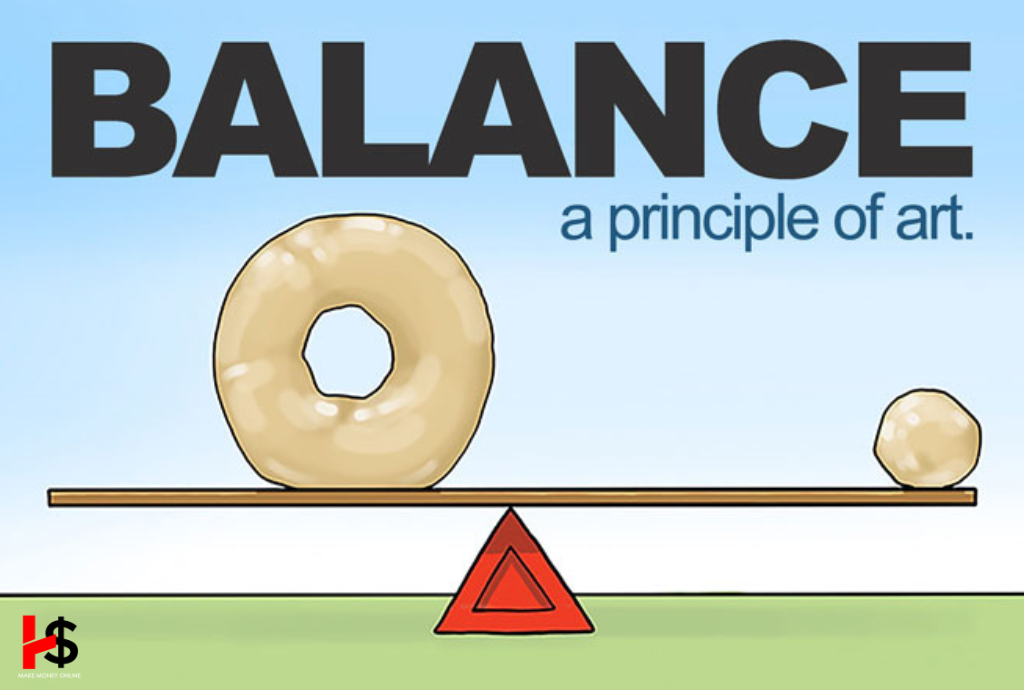
The balance of physics and design are similar. It gives a design the solidity and structure it needs. Similar to physical weight, items in design have weight; this kind of weight is known as visual weight. Achieving a well-balanced distribution of visual weight in a design is crucial for making a powerful and harmonious impact.
Imagine it as placing two objects on a seesaw. If one side is significantly heavier, the viewer’s attention is likely drawn to the heavier side. On the other hand, when both sides have equal weight, the seesaw remains perfectly balanced without either side touching the ground.
Proximity
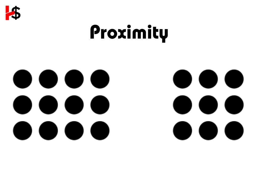
Actually, there is a relationship between the elements because of their proximity. On the other hand, proximity does not imply that components must be arranged in that order. It implies that there should be a precise visual path connecting them. Everything we insert on a page has a weight, as we have discovered. Color, size, or texture could all be considered weight.
Alignment
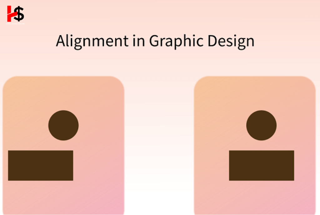
It is the basic principle of design. The positioning of visual components determines how accurately the design lines up in the composition. This process is known as alignment.
Alignment is a tool used by designers to combine and arrange pieces, establish relationships between them, establish balance, and provide precise results.
In design there are two main alignment principles:
- Edge alignment
- Center alignment
It’s essential to keep things organized and in order to achieve design perfection. An essential method for producing significant and faultless designs is alignment.
Contrast
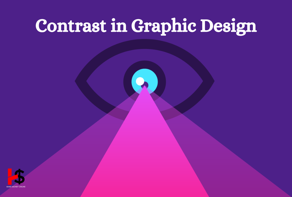
A difference exists between the two opposing design elements, and this creates contrast. Dark and bright, modern and traditional, big and small, and so forth are the most prevalent contrasts. In order to ensure that every side is readable, contrast directs the viewer’s attention to the important components.
Space
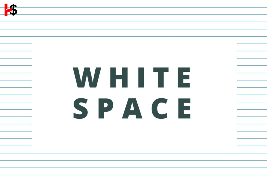
Within the context of art, space describes the separations and spaces that exist between, around, above, below, and inside design elements. Positive and negative space must always be taken into account in designs.
While the other elements focus on what you incorporate into your design, white space is the only one that specifically deals with what you don’t add. White space consists of the empty areas surrounding the elements within your composition.
Hierarchy
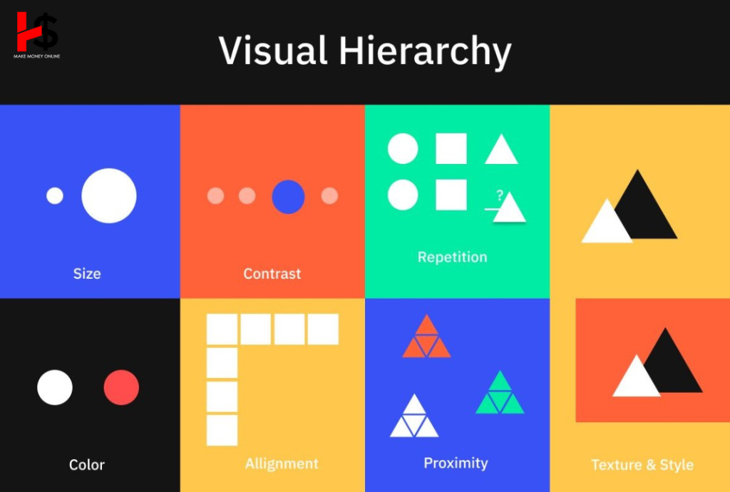
One of the fundamental principles of design hierarchy involves the visual ranking of your design elements.
The hierarchy isn’t based on design style but rather on the order of elements. An effective design directs the viewer’s attention through each section in a specific order as established by the designer. For instance, when you visit a website’s homepage, you’ll typically find a navigation bar and logo followed by a prominent header image or text with a clear Call to action.
Emphasis
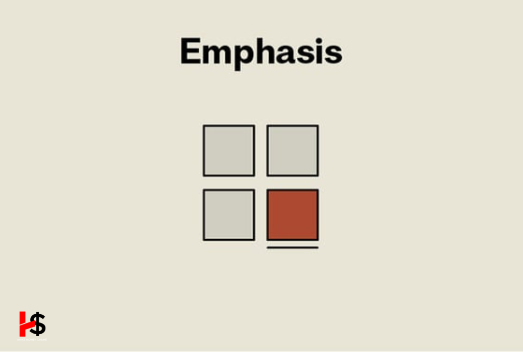
Emphasis is about creating a clear set of priorities. Start by allowing your mind organize the information, and then design your layout in a way that follows this order.
Imagine you’re designing a concert poster. Consider which piece of information is of utmost importance for the audience. If the brands name is the most essential information, you can place it in the center and make it the largest element on the poster.
Conclusion
Using the same typeface makes it simple to draw attention to the location, date, and other relevant information. Everything relies on the kind of focus you wish to achieve. Your design may fall short of its objective if you begin writing your content without having a clear idea of what you want to say. Clearing the concepts for your design should therefore be your first concern.
Read More:
